Welcome
to the
Tourism
Calgary
Playbook.

Oh, hey there!
Thanks for stopping in. This playbook is your go-to guide for everything related to the Tourism Calgary brand. Feel free to explore from the side navigation, or jump to the section you’re looking for. 😎
Calgary is no
ordinary place
and Calgarians
are no ordinary
people.
We are a bold, vibrant and evolving city, consistently ranked among the top in the world for liveability, affordability and quality of life. But for too long, we've struggled to convey the diversity, excitement and limitless possibilities that exist here. That's why the Blue Sky City rebrand is a new way forward.
This playbook demonstrates how we embrace the Blue Sky City rebrand, while also sharing our own unique Tourism Calgary brand articulation and guidelines.
North Star
Right out of
the blue.
With every action ask yourself:
Does this approach feel right out of the blue?
This articulation captures and conveys the adventurous spirit, imagination and unexpected possibilities our city offers. Whether you're a visitor, business or fellow Calgarian, our city will inspire, delight and exceed your expectations. While we don't need to explicitly state this expression in external facing communication, it guides our approach for how our brand talks, thinks, looks and shows up in the world.
Why it works:
- Clear tie to Blue Sky City
- Leverages unexpected possibilities
- Unmistakably tourism
- Inspires creativity and blue-sky thinking
What Makes Our Brand Unique
We are warm, enthusiastic hosts.
Yep, you don’t become the world’s friendliest city by accident. Calgarians stands out for our world-class hospitality and genuine enthusiasm for sharing our city. You’re always just one hello away from a new friend here.
We are diverse in our people, culture and experiences.
Calgary has so much more to offer than most people realize. As Canada’s third most diverse population, we are passionate about sharing our vibrant stories, rich culture, exciting outdoor adventures and flourishing business opportunities.
Where blue-sky thinking, passion
and possibilities converge.
Home to big city amenities, four-season adventures, world heritage sites, the world’s friendliest people and breathtaking natural landscapes. All converging to create a city where the possibilities are as limitless as our blue skies.
Our Manifesto
Your Role in our Brand
Each of us plays a vital role in delivering a consistent and positive brand experience for everyone who interacts with us. By staying true to our brand and sharing what makes us unique, we build trust, foster deeper connections, and present our city in the best possible light. Interestingly, the clearer our brand is defined, the more freedom we have to play. This playbook serves not only to provide guidance, but also to inspire your creativity.
A brand is a promise consistently
delivered. By each and every one of us.
Brand Model

Brand Personality
We are warm, genuine
and enthusiastic hosts.
Always quick with a smile or a helping hand. Whether you’re a first-time visitor or lifelong Calgarian, we make everyone feel at home in our city.
We are smart, playful and brimming with endless possibilities. The sky is truly the limit here. We love to think big and the power of “What if...”
With a deep love for Calgary, we celebrate our diverse people, culture, stunning landscapes and entrepreneurial spirit.
With every action ask yourself:
“What if...”
+
“How can I help?”
Brand Personality
We are
warm,
welcoming,
smart & playful.
With every action ask yourself:
Does this make our brand feel warm, welcoming, smart & playful?
Our Mindset
We set out each day to enhance Calgary’s appeal as a unique destination to visit, live or do business.
With every action ask yourself:
Does this make our brand feel warm, welcoming, smart & playful?
Who we champion
Our city at large. Calgary is spectacular, diverse and full of hidden gems.We are also a major economic & innovation hub, brimming with opportunity.
Calgarians. Our warmth, friendliness and hospitality are unmatched.
Our breathtaking nature and scenery. From our majestic Rockies and thrilling adventures to our beautiful parks, sunsets and beyond.
Our partners, experiences and B2B opportunities. We proudly promote our partners, events, unique attractions and amenities to position Calgary as both a world-class travel and business destination. Surrounding attractions. We also promote areas beyond Calgary such as Banff, Drumheller, Bragg Creek, Brooks, Airdrie and more.
Tone of Voice
Overview
Building on our brand personality, we have a distinct tone of voice. This defines how we speak and bring our brand to life through written expressions.
The Tourism Calgary
voice is warm,
welcoming, smart &
playful.
Just like a person has different personality traits so does our brand. Depending on who we’re talking to, one trait might come through more than others, but they all work together to create a familiar, consistent voice.
Warm & Welcoming
It feels
Friendly, passionate,
genuine
But never:
Flaky, naive, salesy
How we Speak
Like your favourite Calgarian, we are warm, friendly and welcoming. We pride ourselves on our western hospitality and make everyone feel at home in our city. This means we are bright, genuine and enthusiastic. We embody Calgary’s friendliness and 333 days of sunshine. When we speak, it should feel personal, like catching up with a friend over a coffee or beer. We’re still professional, but not stuffy. We’re a trusted host, but we feel like an old friend.
Examples
We welcome you with open arms and open skies.
Where business meets bucket list.
Of course we’re one of the friendliest cities in the world. We get sunshine almost every day.
Home to the greatest outdoor show and friendliest people on Earth.
Smart & Playful
It feels
Fun, innovative, aspiring
But never:
Silly, distracting, forced
How we Speak
Calgary is full of unexpected possibilities. When we speak, we want to convey this sense of limitless adventure and opportunity. So embrace blue-sky thinking. Be fresh, inventive, and imaginative. Give every sentence an idea, smile, or surprising twist. Anything is possible here. We want our language to reflect that. Celebrate our diverse people, places, and experiences. Think of interesting combinations that are unique to calgary. Evoce the senses when possible. Paint a picture of endless possibilities.
Examples
Today’s forecast: Blue-sky thinking.
Think big. Like Canadian Rocky Mountain big.
A festival’s more fun when it’s on an island.
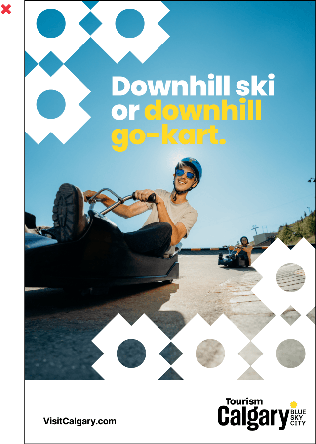
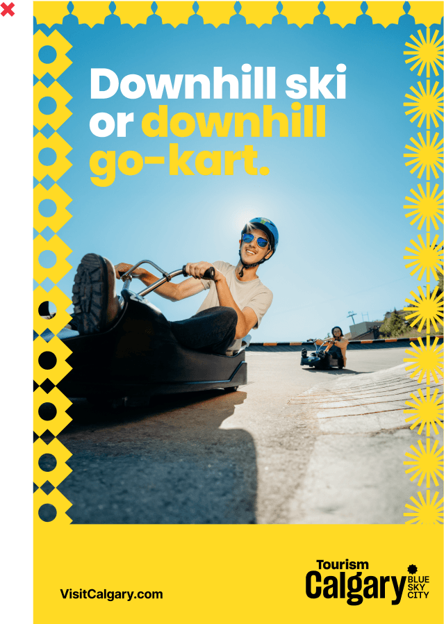
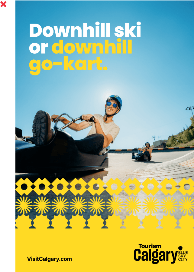
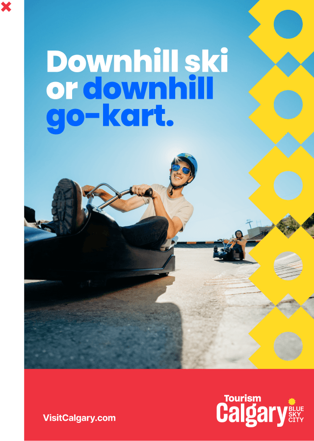
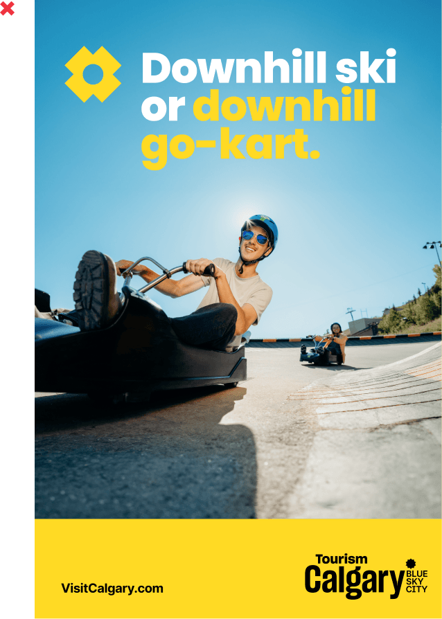
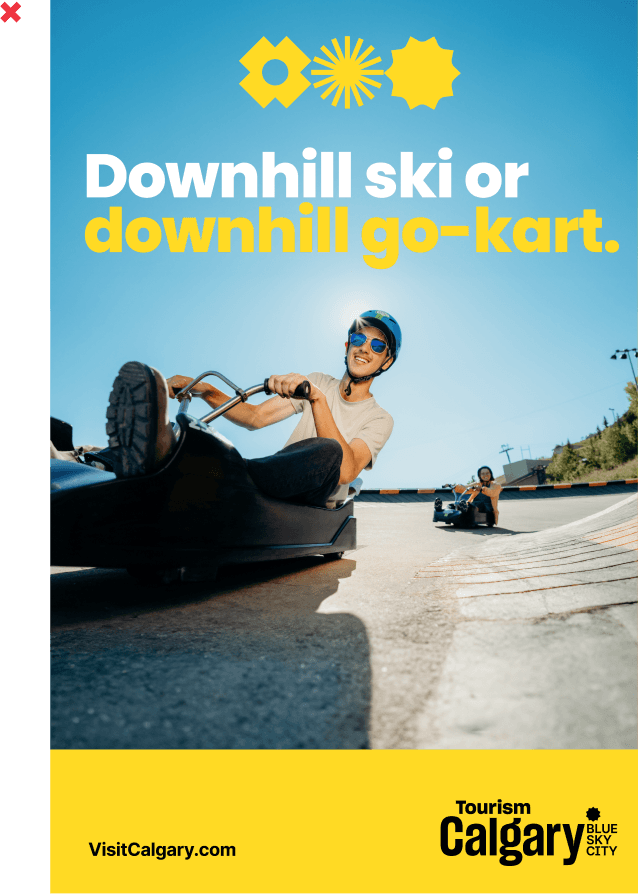
Gravity is stronger in Calgary. Downhill karting proves it.
Copy Examples
Find your unaccording to plan.
Just like a person has different personality traits so does our brand. Depending on who we’re talking to, one trait might come through more than others, but they all work together to create a familiar, consistent voice.
Discover more at www.visitcalgary.com
Big-city amenities. Small-town friendly.
Like your favourite Calgarian, we are warm, friendly and welcoming. We pride ourselves on our western hospitality and make everyone feel at home in our city. This means we are bright, genuine and enthusiastic. We embody Calgary’s friendliness and 333 days of sunshine. When we speak, it should feel personal, like catching up with a friend over a coffee or beer. We’re still professional, but not stuffy. We’re a trusted host, but we feel like an old friend.
Discover more at www.visitcalgary.com
333 days of sunshine to make any sporting event shine.
Like your favourite Calgarian, we are warm, friendly and welcoming. We pride ourselves on our western hospitality and make everyone feel at home in our city. This means we are bright, genuine and enthusiastic. We embody Calgary’s friendliness and 333 days of sunshine. When we speak, it should feel personal, like catching up with a friend over a coffee or beer. We’re still professional, but not stuffy. We’re a trusted host, but we feel like an old friend.
Discover more at www.visitcalgary.com
Audience Maps
For Visitors
Insight
Visitors want to have a unique and memorable experience. They want the promise of a distinct experience that can't be replicated anywhere else.
Messaging Guidelines
- Showcase the incredible range of experiences that exist here
- Present Calgary as a friendly, and welcoming place to visit
- Give every sentence an idea, smile or unexpected twist
Messaging Examples
Explore the city by bike, train or lazy river.
Catch a wave 1,000 km from the ocean.
We'd give you the shirt off our back or the toque off our head.
Extra sunny days call for extra tasty sips in our beloved Barley Belt.
For Calgarians
Insight
Calgarians are eager to discover new experiences within their own city. They also want to celebrate and share what makes Calgary great with others.
Messaging Guidelines
- Highlight hidden gems and surprising new experiences
- Celebrate our diversity and friendly, welcoming nature
- Inspire Calgarians to be enthusiastic hosts and share our city with others
Messaging Examples
Visit the ski hill to go-kart.
Concert hop on an island.
Famous for our sunny disposition.
Say hello in over 120 languages.
For Businesses
Insight
Businesses seek thought leadership, innovation, favourable logistics and unique experiences. They also want a partner who goes the extra mile to provide a great experience and make their event a success.
Messaging Guidelines
- Embrace our innovative spirit and blue-sky thinking to convey the sense of endless possibilities
- Find novel ways to combine business messaging with Calgary’s unique features
- Demonstrate the warmth of our people and our hospitality that goes above and beyond
Messaging Examples
Where business meets bucket-list.
Embrace blue-sky thinking and bluebird days.
Big-city amenities. Small-town friendly.
We go above and beyond to make every event one you’ll want to repeat.
Style & Grammar
This section outlines our style and grammar guidelines to help keep our brand messaging clear and consistent.
Basics
Headline Examples
Active Voice
Use active voice, not passive voice. In active voice, the subject of the sentence performs the action. It’s direct and often clearer.
✓ Calgary is full of unexpected possibilities.
✗ Unexpected possibilities are found throughout Calgary.
Be concise.
Use plain, simple language. Prioritize short words and sentences. Write and rewrite. Then rewrite some more.
✓ River walk or surf.
✗ Take a leisurely stroll along the river or experience the thrill of river surfing.
Avoid cliches.
We’re all about the unexpected. Push past first-thoughts to find fresh, inventive ways to convey our message.
✓ Home to unicorn start-ups and real-life dinosaurs.
✗ Calgary is great for work and play.
Get specific.
The more specific we are, the more interesting and engaging our writing becomes.
✓ Say hi to Shania, Joni and the Hip.
✗ Explore the best of Canadian music at Studio Bell.
Have fun.
Be playful and adventurous with language. The more you enjoy writing for our brand, the more people will enjoy reading it.
✓ Ye olde family time is more fun at Heritage Park.
✗ Heritage Park is a fun place to bring your family.
Capitalization
We use Sentence case for headlines and sentences. Sentence case capitalizes the first letter of the first word while leaving the rest lowercase (proper nouns are an exception and are always capitalized).
Capitalization Examples
Have breakfast with a polar bear.
Stumble into Shakespeare.
Hashtags
We use the hashtags #BlueSkyCity and #CaptureCalgary to increase visibility and engagement on social posts. Always use Title Case in hashtags.
Don’t force hashtags. Use at the end of post copy as desired.
Hashtag Examples
Have breakfast with a polar bear.
Stumble into Shakespeare.
Emojis
Emojis are a fun way to add personality to our writing but use them sparingly and deliberately.
Emojis Examples
48 hours in Calgary, but it's already planned for you.👌 Don't miss the fall edition of how to spend a perfect weekend in the #BlueSkyCity
Punctuation
Refer to our Punctuation Guide to see how we handle dates, numbers, symbols, times and more.
Canadian spelling
Always use Canadian spelling. Set your language to English (CAN) in Word or double-check with Google. For more, see our Word List.
Visual Identity
There are countless ways to visually express the Tourism Calgary brand, but it’s important to keep a few basic principles in mind to ensure a consistent and cohesive brand experience.
We begin with our logo, but our visual identity extends far beyond that. Our supporting colours, typography, and graphic elements provide the foundation that truly brings the brand to life.
Next, we’ll explore real-world examples of our brand in use. These examples demonstrate how our verbal and visual identity work together to create moments of surprise and delight.
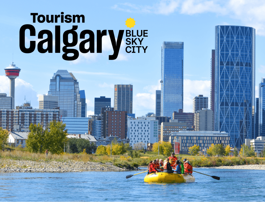
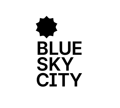
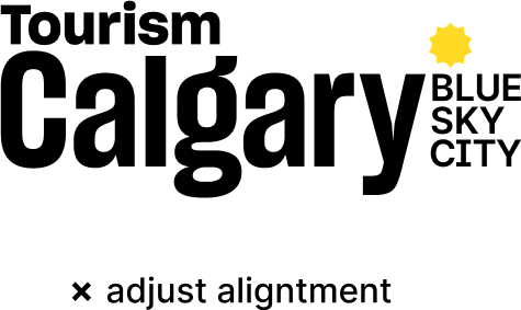
Logos
The Tourism Calgary logo was created under the civic Calgary brand umbrella. Adding Tourism to the Calgary wordmark defines our organization but doesn’t take away from the prominence of the Calgary destination.
Our logo suite is relatively simple with only a few variations so application is easy to use and understand.
Wordmark with tagline
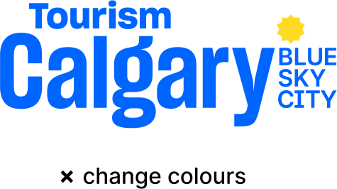
The 2-colour wordmark and tagline lockup is our primary logo version; use these versions as much as possible. For design flexibilty, the logos can be placed on any brand colour except yellow. For placement on top of a photo, use the version that ensures enough contrast for legibilty.
Primary Logo: 2-Colour
Primary Logo: 2-Colour Reversed
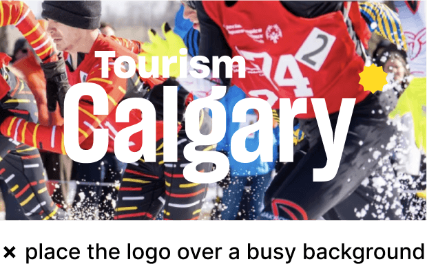
Placement on Background
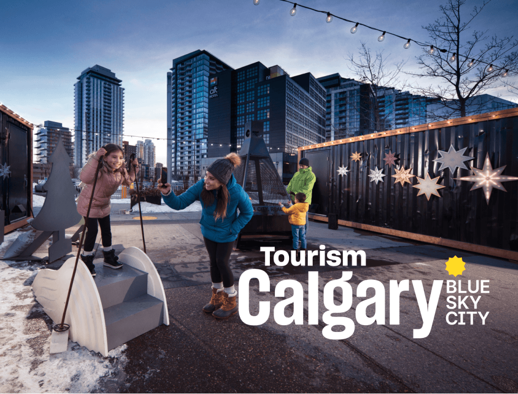
use on a photo where there is enough negative space so it can be read clearly
Legibility of the primary logo can get compromised if there is not enough contrast behind it. When this happens, use these single-colour versions instead. Printing constraints can also require you to use these logo variations i.e. black and white printing
Primary Logo: Black Only
Primary Logo: White Only
Wordmark without tagline
Instances in brand applications can arise where the primary logo lockup does not always work the best. Whether you want to emphasize the Blue Sky City tagline on its own, or the logo placement area is small, we’ve broken up the logo lockup into separate parts to offer the most design flexibility. Follow the same background placement rules as above.
Wordmark Only: 2-Colours
Wordmark Only: 2-Colour Reversed
Wordmark Only: Black Only
Wordmark Only: White Only
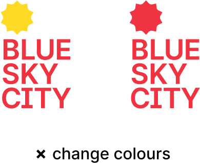
Tagline Lockup
Tagline: 2-Colours Reverse
White Only
Logo Don'ts
You can help ensure the integrity of our brand by never altering our logo’s proportions, colours, or placement.

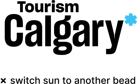
Logo Clearance
You can help ensure the integrity of our brand by never altering our logo’s proportions, colours, or placement.
Minimum Size
You can help ensure the integrity of our brand by never altering our logo’s proportions, colours, or placement.

Colour
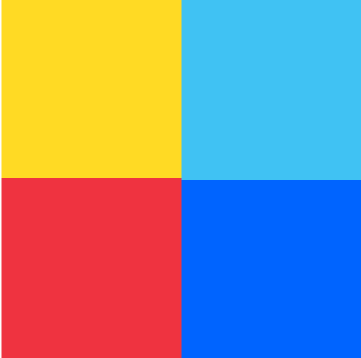
Guided by the Calgary brand, our palette is comprised of bright, saturated colours that evoke excitement, curiosity and are welcoming in nature. The addition of a darker blue sets Tourism Calgary apart from the civic brand.
Primary
The primary palette consists of 4 colours, with cyan blue being the dominant colour. Use these colours at their full opacity versus tints.
CYAN BLUE
sky
75% Pantone Pro. Cyan
Pantone 2995 (where solid is required)
R64 G194 B243
#40C2F3
C75 M0 Y0 K0
COBALT BLUE
rivers
Pantone 2935
R0 G100 B255
#0064FF
C100 M52 Y0 K0
BRIGHT YELLOW
sun
Pantone 115
R255 G218 B36
#FFDA24
C2 M11 Y94 K0
BOLD RED
energy
Pantone 032
R239 G51 B64
#EF3340
C0 M100 Y100 K0
Secondary
The secondary palette consists of 4 colours, plus black and white. This colour set provides complementary shades to the primary palette - no drastic shift in colour variation. These colours are intended to only use when additional colours are required to support the primary palette. Instances when this may arise are when creating infographics, newsletters, internal reporting, social posts, etc.
LIGHT BLUE
R123 G230 B254
#7BE6FE
C100 M52 Y0 K0
HAZY BLUE
R69 G132 B255
#4584FF
C70 M49 Y0 K0
DEEP BLUE
R0 G59 B149
#003B95
C100 M88 Y9 K1
WARM ORANGE
R255 G167 B64
#FFA740
C0 M40 Y84 K0
PURE BLACK
R239 G51 B64
#000000
C0 M0 Y0 K100
Primary & secondary colour pairing examples
SKY (CYAN BLUE) & RIVERS (COBALT BLUE) + WARM ORANGE, LIGHT BLUE, AND PURE BLACK
RIVERS (COBALT BLUE) & SUN (BRIGHT YELLOW) + HAZY BLUE, LIGHT BLUE, AND PURE BLACK
SUN (BRIGHT YELLOW) & ENERGY (BOLD RED) + WARM ORANGE, HAZY BLUE, AND DEEP BLUE
Typography
Guided by the Calgary brand, our typography system is comprised of only two font families - Poppins and Inter. Just like our colour palette, the typography should evoke excitement, curiosity and be welcoming in nature. Both font families offer a large selection of styles for design flexibility.
Primary Font - Poppins
abcdefgijklmnopqrstuvwyz1234567890
ABCDEFGHIJKLMNOPQRSTUVWXYZ
Poppins is versatile sans-serif typeface with a friendly look. Its overall simplicity in shape make the font very legible, approachable and inclusive.
The rounded letterforms match the style of the geometric brand beads.
Headline styling
Poppins
Extrabold
Usage
- To create high-impact headlines use ‘ExtraBold’
- sentence case
- tighten letter spacing: just kerning in figma by -2%, or in adobe by -25
Headline styling
Poppins
Bold
Poppins
Bold
Usage
- use 'Bold'
- uppercase
- tighten letter spacing: adjust kerning in figma by -2%, or in adobe by -25
- additional styling alternative: adjust kerning in figma by 20%, or in adobe by 200
Body Copy
Poppins
Regular
Usage
- For longer bod copy or any small tex - user ‘Regular’ or ‘Medium’
Secondary Font - Inter
abcdefgijklmnopqrstuvwyz1234567890
ABCDEFGHIJKLMNOPQRSTUVWXYZ
Inter is a versatile sans-serif typeface. Its tall x-height ensures readability at smaller sizes.
Pairing Inter with Poppins is helpful to create contrast in the type styles, especially when there is a range of messaging hierarchy.
Subheads & Footers
Inter
Bold
Inter
Bold
Usage
- use 'Bold'
- uppercase
- tighten letter spacing: adjust kerning in figma by -2%, or in adobe by -25
- additional styling alternative: adjust kerning in figma by 20%, or in adobe by 200
Body Copy
Inter
Regular
Usage
- For longer body copy or any small text - use ‘Regular’ or ‘Medium’
Graphic Elements
Along with colour and typography, branded graphics help elevate a brand. They provide design interest, contrast and depth within a layout or animation.
It is important to remember that these graphic elements should be secondary to any imagery, copy or messaging.
Beads
Our brand features a library of graphic beads to be used creatively as a part of our wider visual language. These beads are designed to represent sunbursts, at varying levels of abstraction. To simplify the use of the beads, we have selected 5 beads out of the 16 bead set from the Calgary civic brand.

✗ do not create any new beads or modify existing set
Bead Patterning
It’s important to use these beads in patterns or groups instead of as single elements or icons on their own. This way, we show how beadwork is about bringing together individual parts to create something greater. The pattern itself can include just one singular bead repeated or a combination of multiple beads.
Usage
- can be filled in any of the primary brand colours, or in white reverse
- layered over imagery
- play with scale
- example uses: animated transition in video, pattern on backside of printed postcard, pattern on inside of tote bag, or presentation title slides
Single Bead Pattern


Multiple Bead Pattern


Multiple Bead Pattern - Alternating


Bead Pattern don’ts
The patterns can make the brand look busy and cluttered if overused so it’s important to not over complicate them design-wise. Keep the patterns to one colour, rather than alternating between colours.
Usage

✗ have more than one colour
Bead Pattern exercise
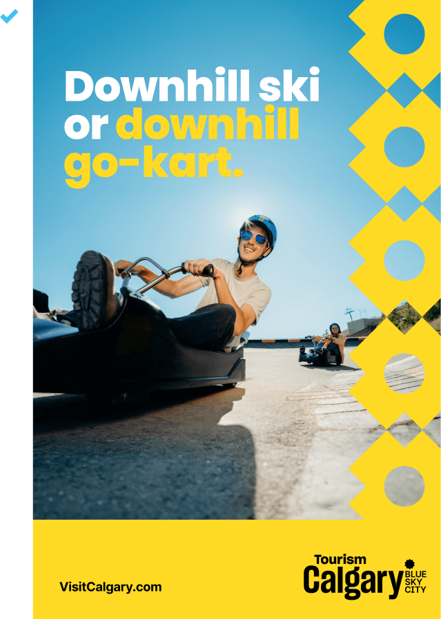
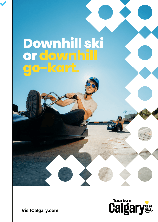
To help understand how the bead pattern should be layered with an image and headline, we’ve created this simple exercise to demonstrate what to do and what to avoid.
brand elements
photo

headline

bead pattern
brand colour
logo & CTA
Approved layouts
Incorrect layouts
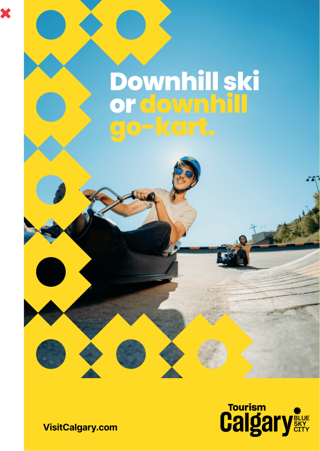
beads are overlapping focal point on photo
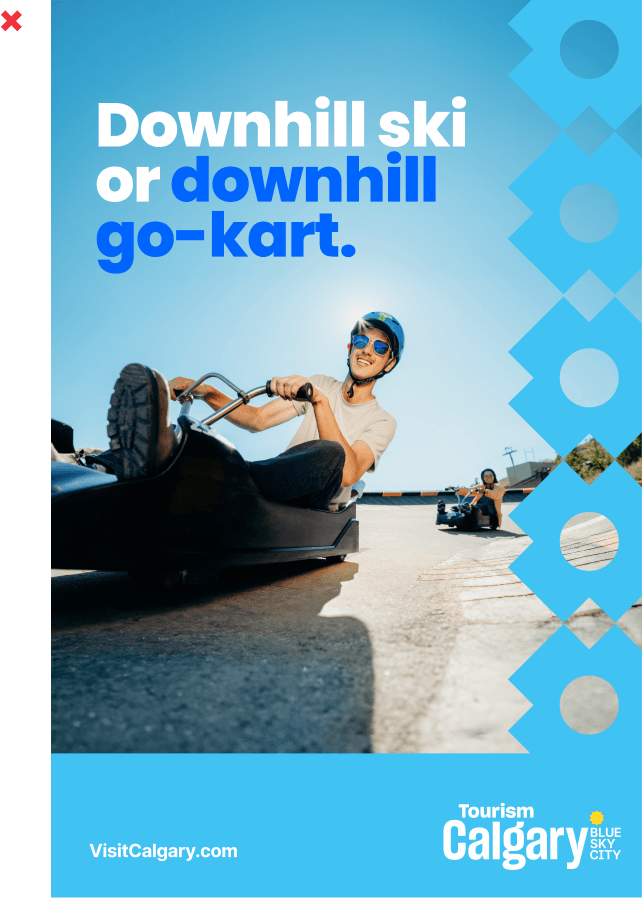
cyan blue does not have enough contrast against photo
beads are competing with headline
beads are competing with photo and headline
beads are competing with photo
beads should bleed into the same colour, too many brand colours in use
beads should not be used as single icon
beads should not be floating but rather grounded/cropped to an edge
The Big C
The Big C is the beaded initial from the civic Calgary logo. Although is it not a part of our logo suite, it still can have a role in our brand as a graphic device.

How we speak
- used to help reinforce the Calgary destination
- place above a photo or on brand a colour background
- bold treatment - expand to edges of frame
- subtle treatment - use at a small size, such as a footer, avatar or icon
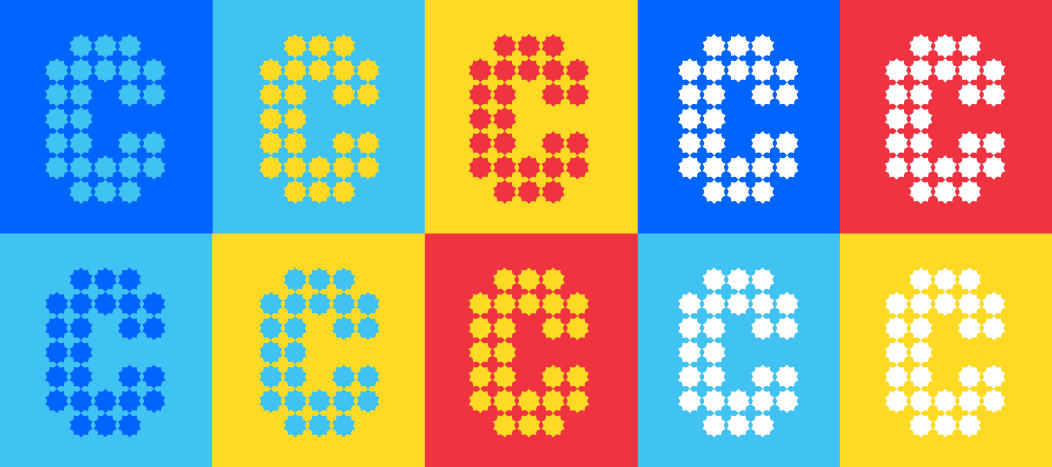
Reference the Brand in Use section for examples of how to use the Big C.
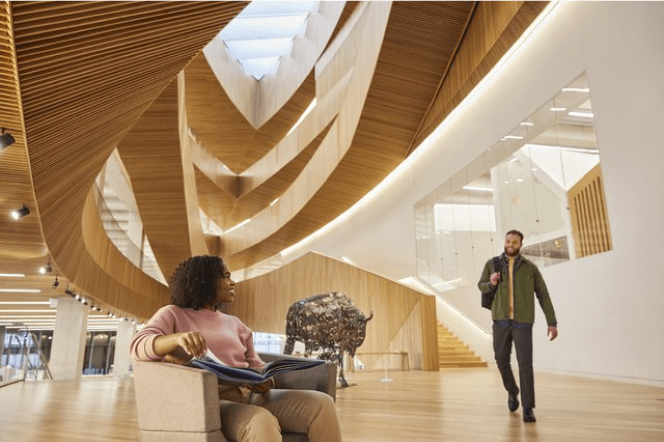
Photography
Photography is the visual appeal (or eye candy) that defines our brand, showcasing the uniqueness of our city, partners, and community. It provides a compelling visual narrative to complement our written expressions.
Our photography should evoke the attributes that make up our brand personality. Friendly and authentic moments and natural lighting creates a welcoming atmosphere. Dynamic compositions with vibrancy sparks curiosity and interest. Capturing our city’s hospitality, events, and adventures in fresh and unexpected ways will set us apart.
Visit our media library to view our fill inventory of images.
We are warm,
genuine and
enthusiastic hosts.
Photography Attributes
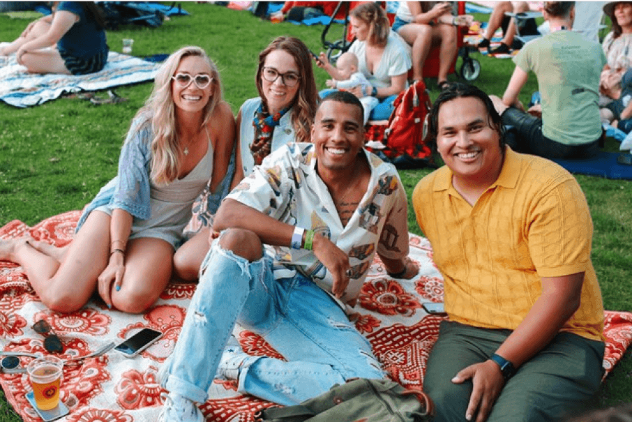
Friendly, authentic moments - the viewer feels involved as a participant, as if they are sharing the experience firsthand.
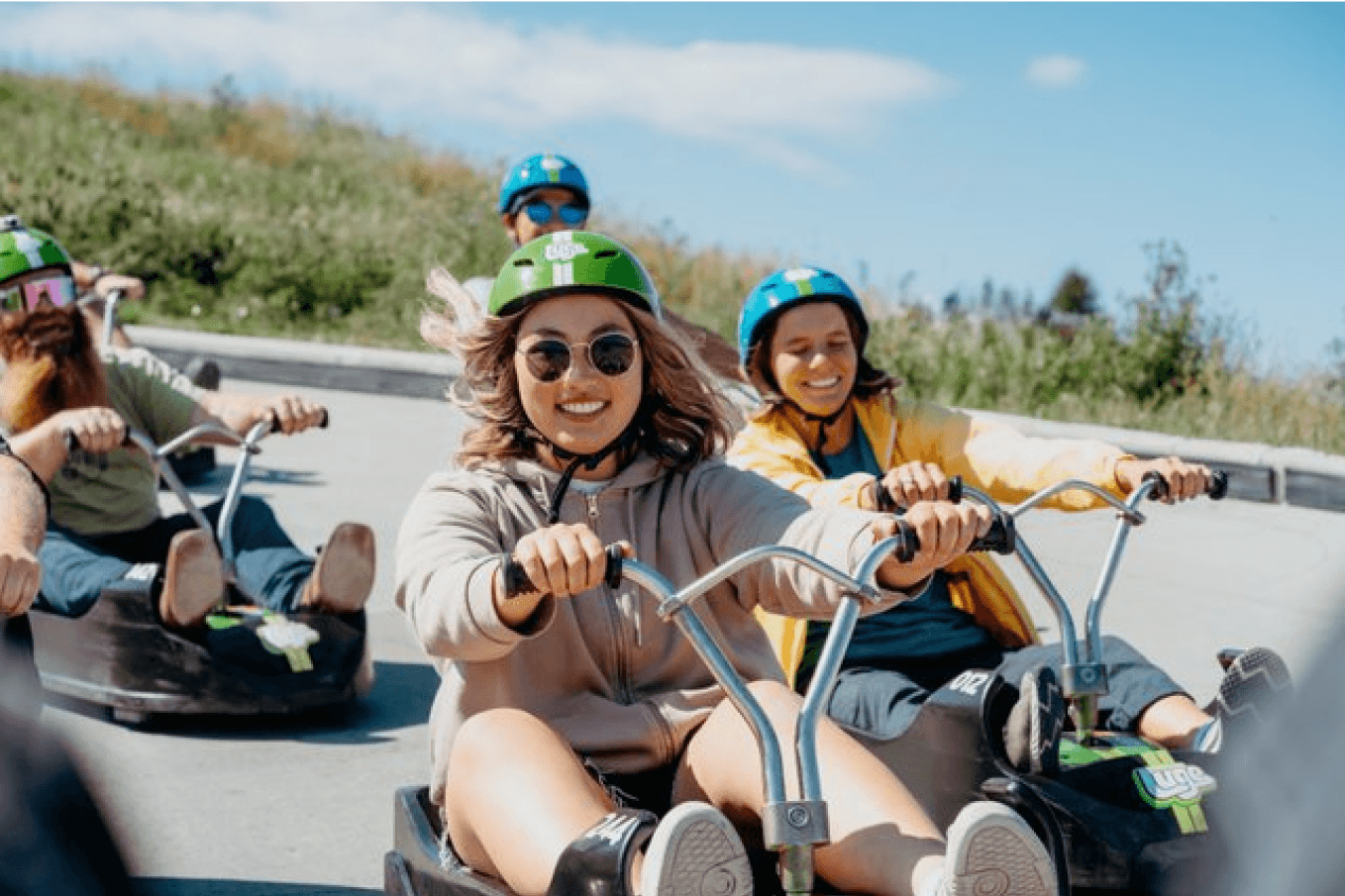
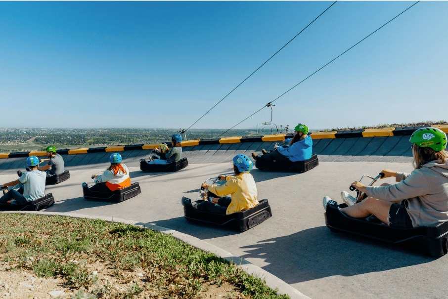
✓ riders are having fun - hair blowing, eyes closed, big smiles
✗ no faces, doesn't show speed, composition lacking excitement
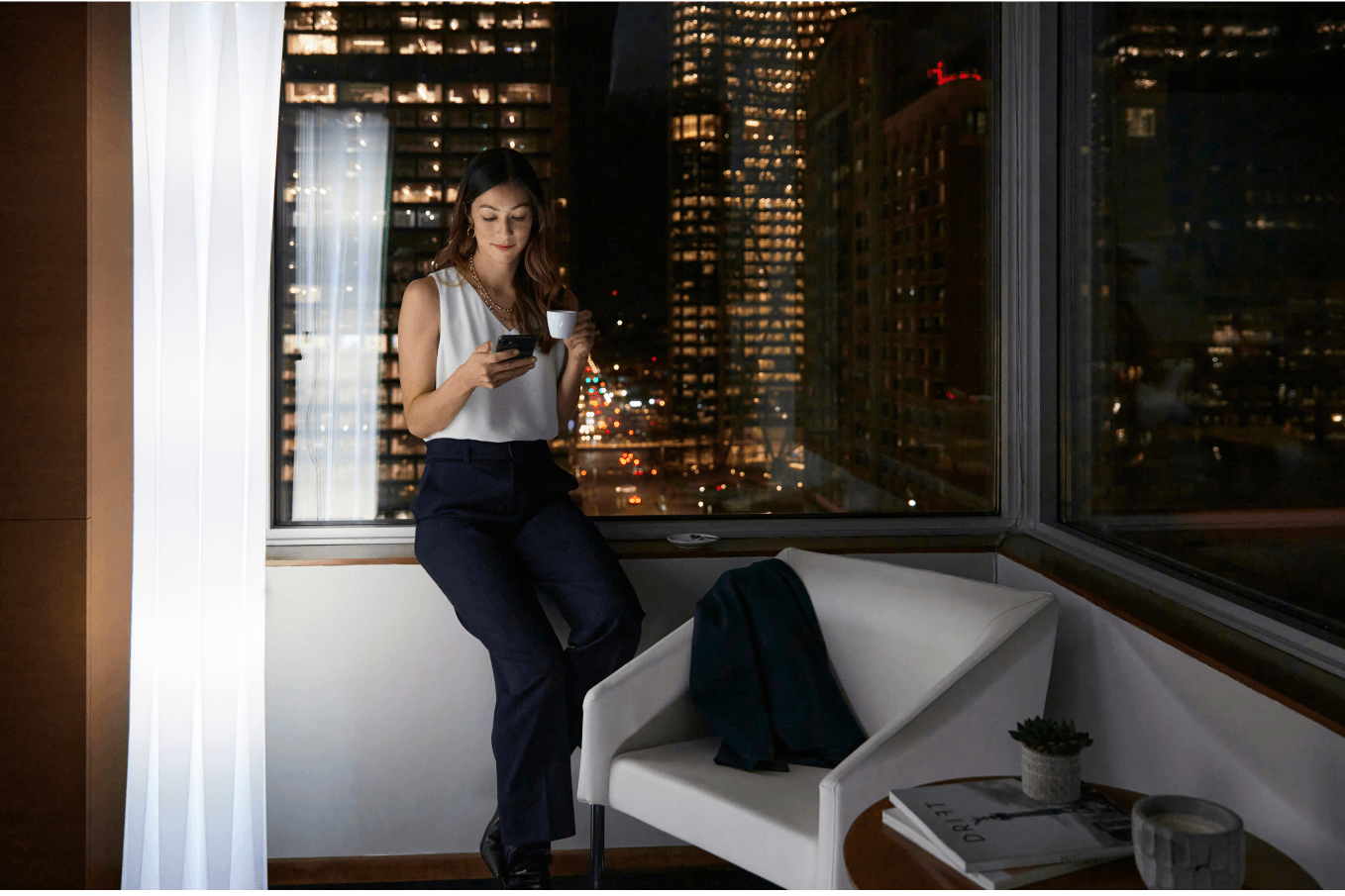
✓ guest looks settled and content in hotel room
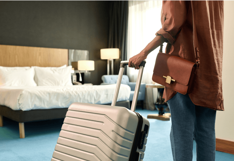
✗ cropped figure removes any emotion and connection to the photo
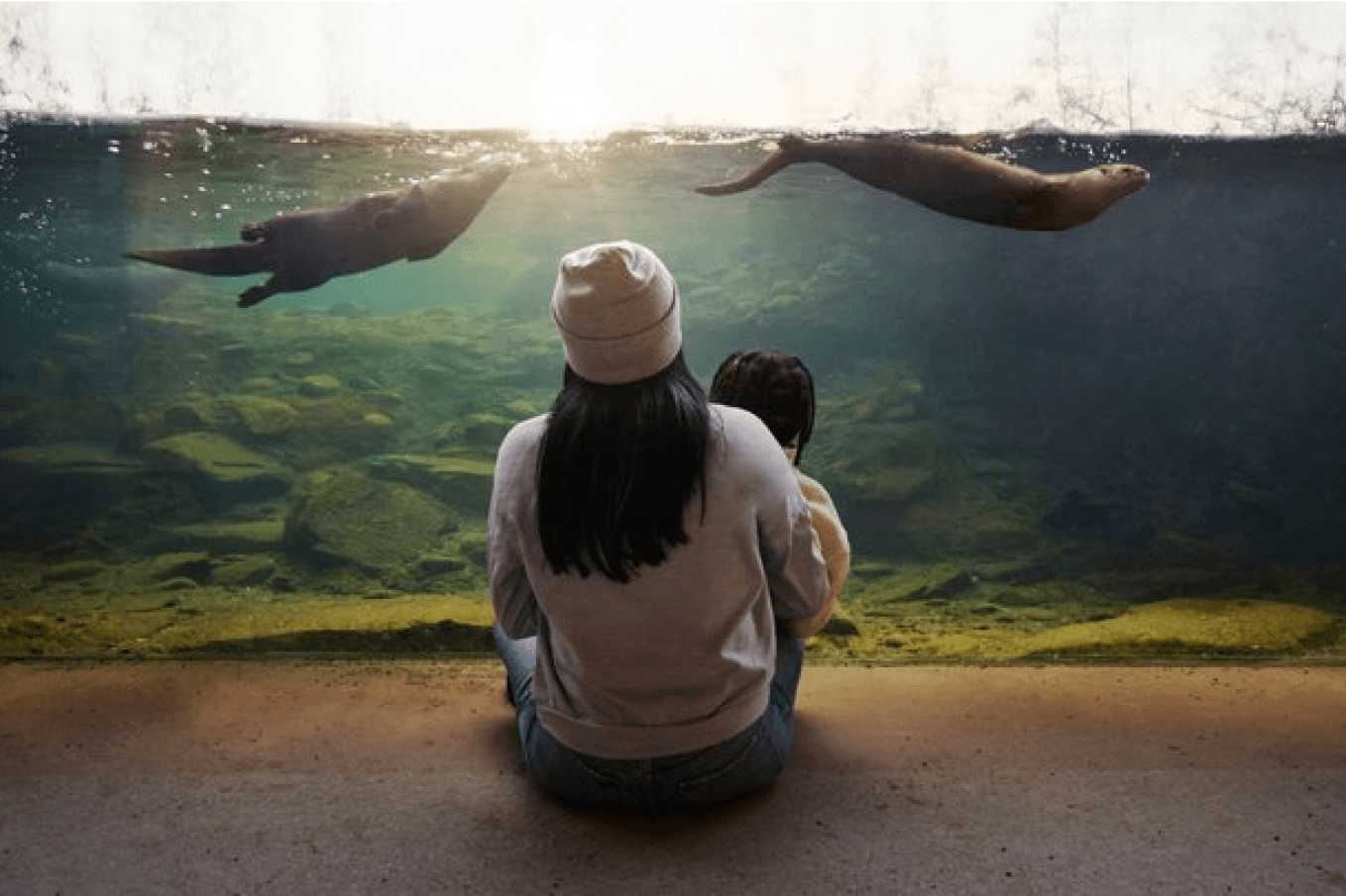
✓ precious moment of mother and child in awe with otters
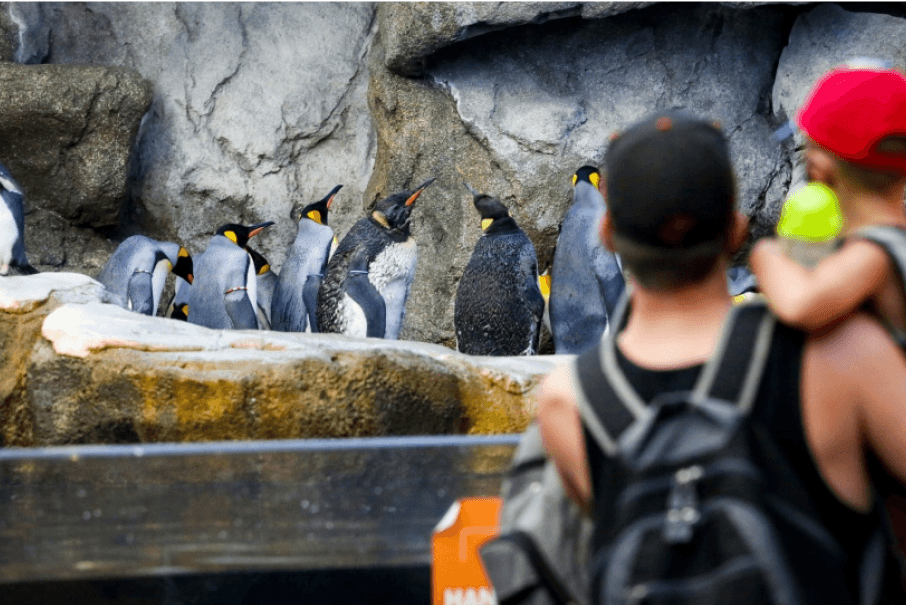
✗ visitors are out of focus and becomes less about the experience
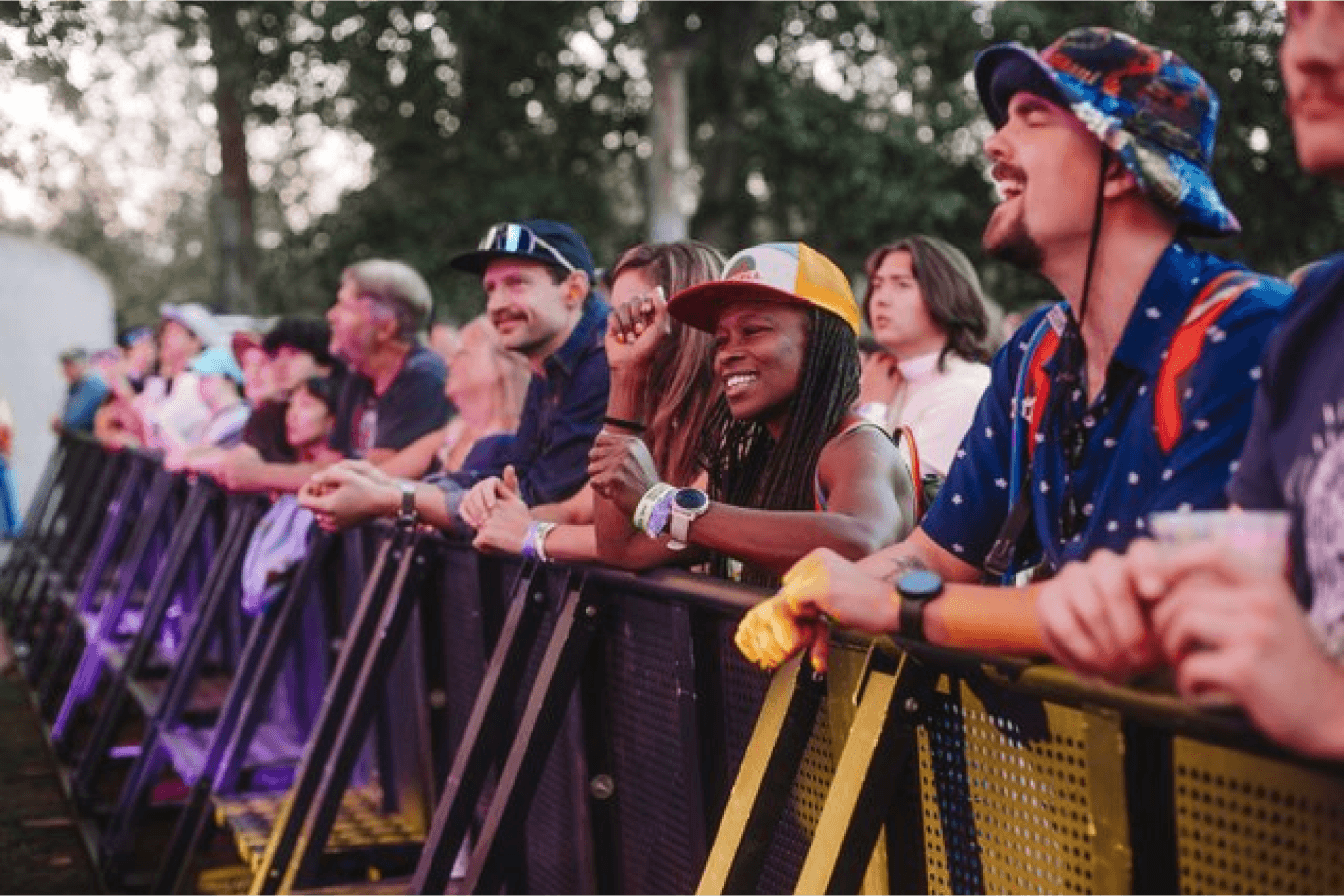
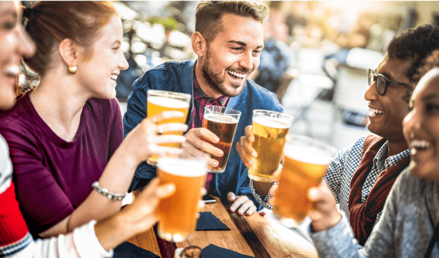
✓ fans embracing the moment during a musical performance
✗ posed for the camera, doesn't show full concert experience
Dynamic compositions - a captivating layout that is full of energy or movement by utulizing interesting angles, varied perspectives, or contrast of scale.
✓ architectural angles draw attention to people in foreground
✗ no obvious focal point
✓ symmetrical composition draws interest to dancer
✗ busy image that reads flat
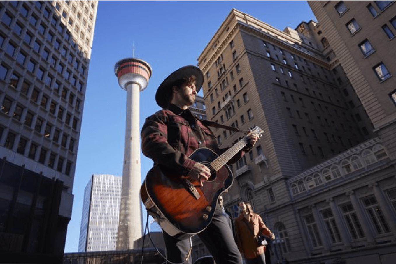
✓ ground view camera angle exaggerates building scale
✗ blurred background removes Calgary context
✓ hikers in bottom 1/4 of composition shows dramatic scale
✗ composition lacks thrill of activity
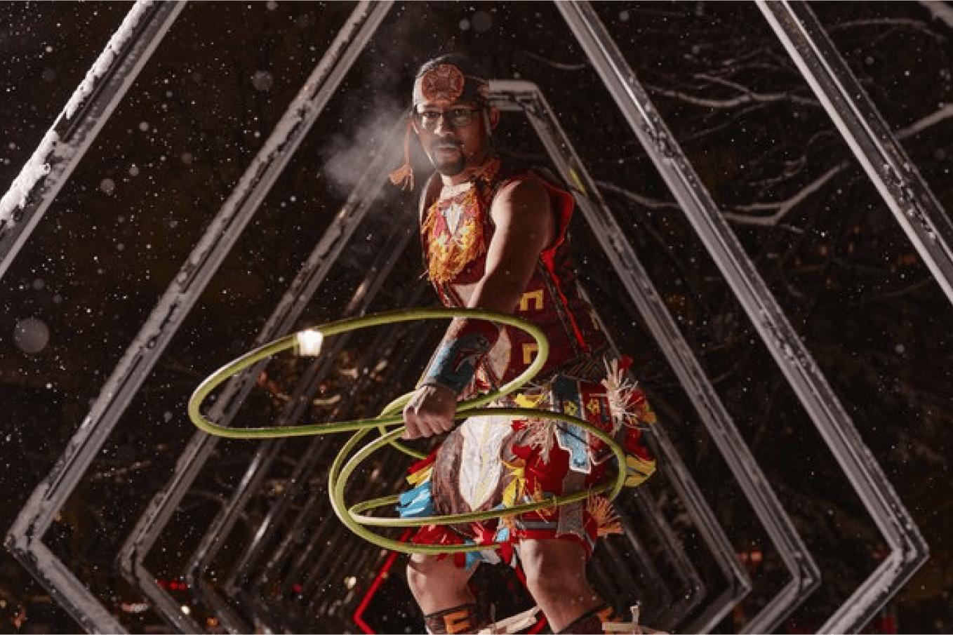
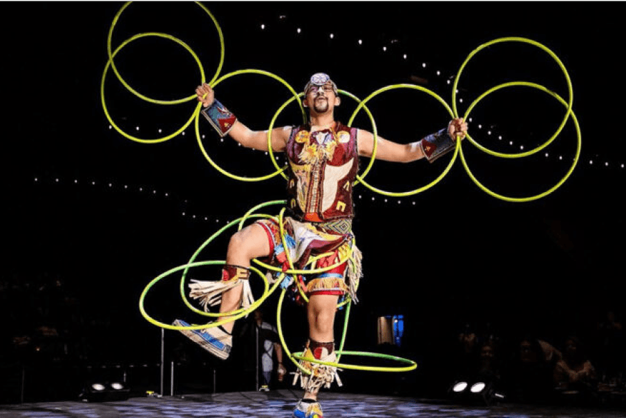
Unexpected things to do - capture unexpected experiences that will reinforce the feeling that Calgary offers more than meets the eyes.
✓ everyone welcome, including pets!
✗ feels very expected, could be in any city
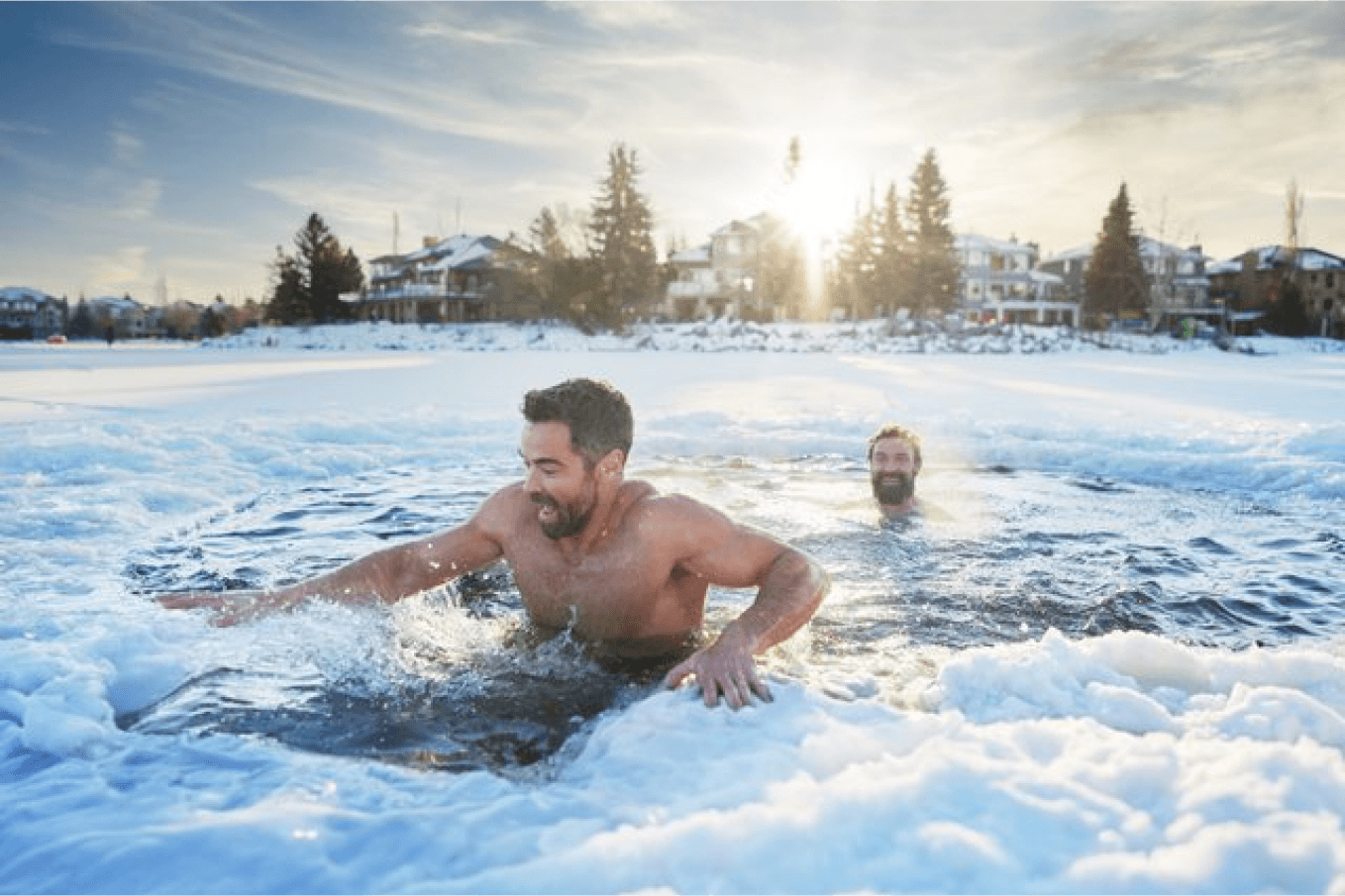
✓ real reaction to the outdoor cold plunge
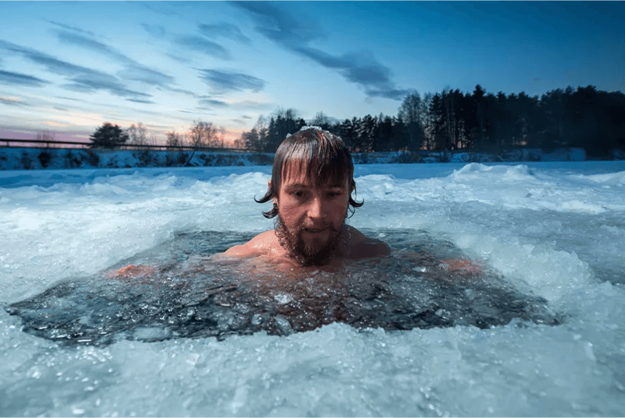
✗ too serious, less of a relatable moment
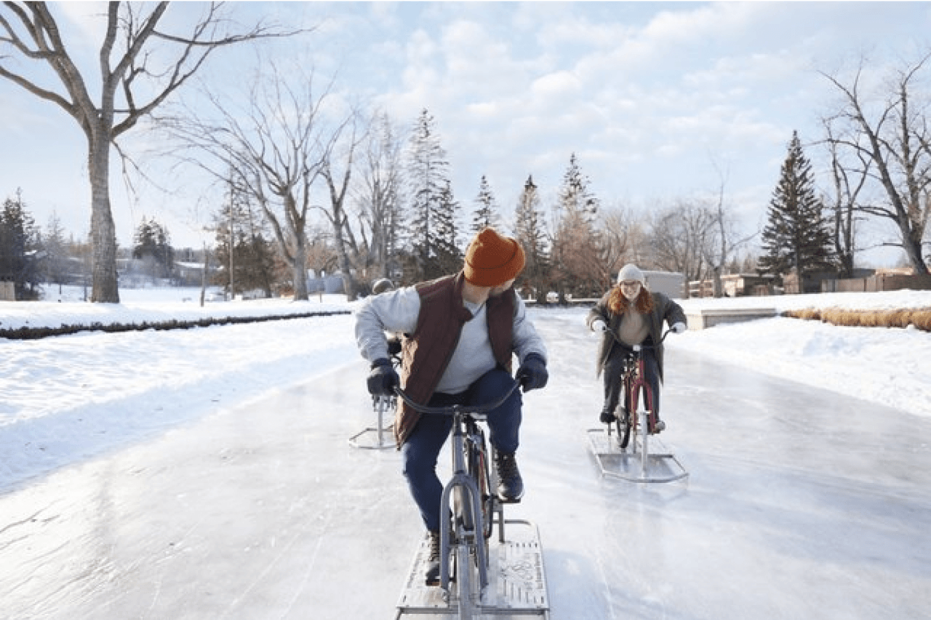
✓ biking on an outdoor rink is more unexpected than ice skating
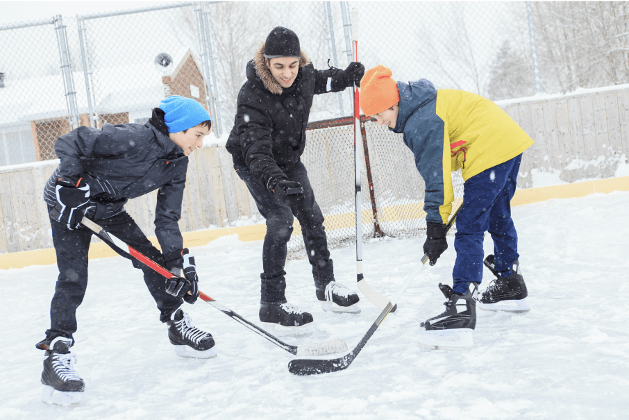
✗ typical outdoor rink scene, feels posed
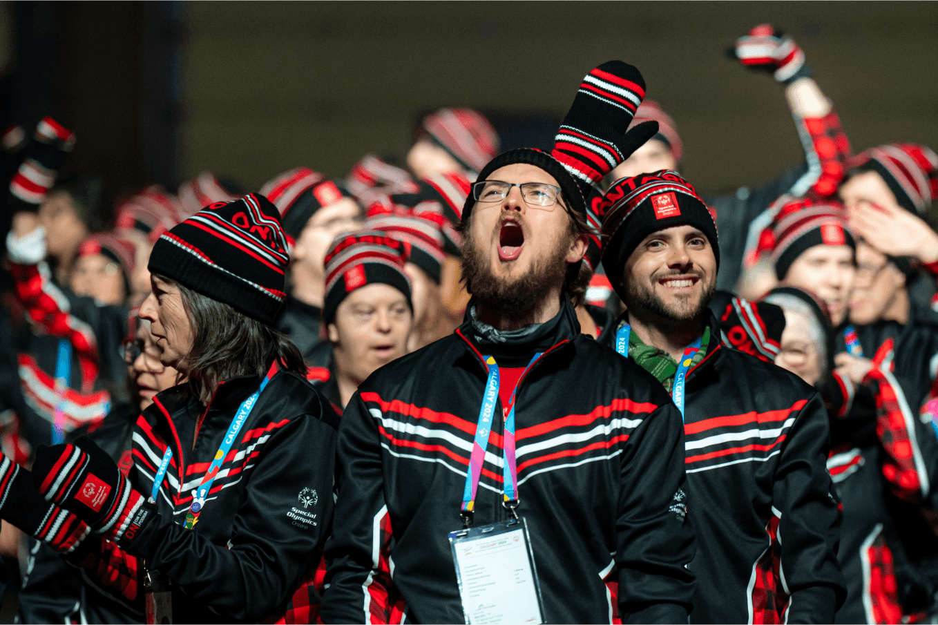
✓ enthusiasm of athletes at Special Olympics
✗ too distant, can't see athletes' facial expressions
Photography Tiers
Our brand photography is categorized into tiers, ranging from hero images to editorial and supporting imagery. The photo library consists of a mix of art-directed photoshoots, event photography, and images supplied from partners.
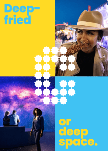
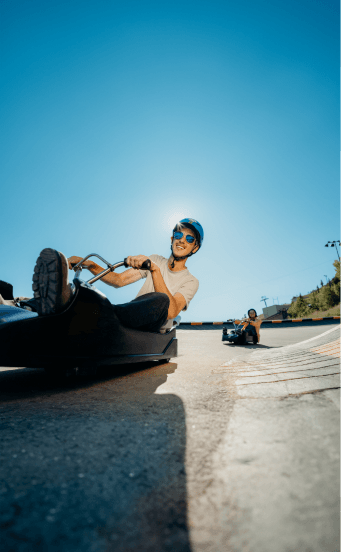
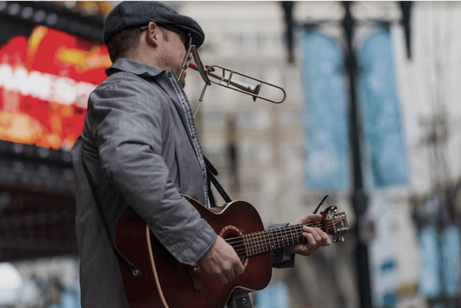
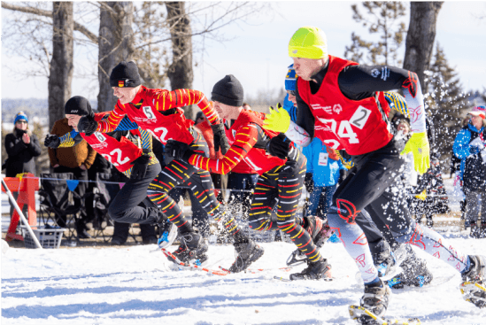
Right Out of the Blue - Hero Photos
Photography Attributes
Photos in this tier should capture and convey the adventurous spirit, imagination and unexpected possibilities our city offers.
Hero images are used when the execution is highly visual. Examples of this include OOH, environmental (tradeshow) graphics, full page print ad, etc.
Criteria
The photo must reflect at least two of the photography attributes:
- Friendly, authentic moments
- Dynamic compositions
- Unexpected things to do
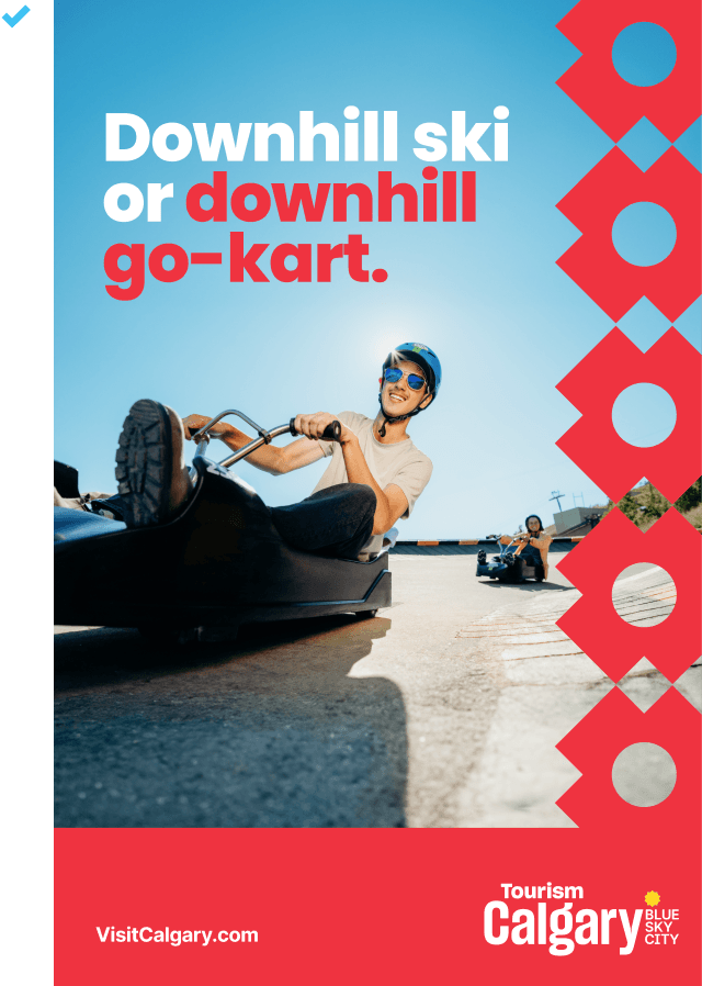
Hero photo example
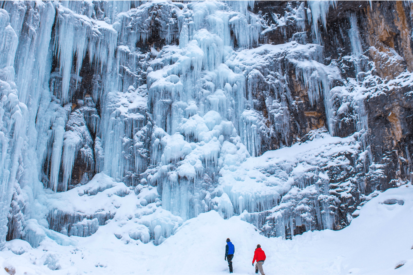
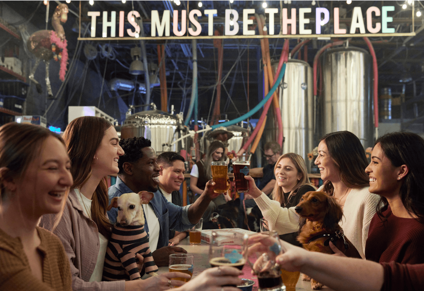
Right Out of the Blue - Editorial Photos
Photography Attributes
Photos in this tier will focus closely on a specific moment. It should showcase genuine interaction between people in a unique and exciting environment.
Editorial images are used for smaller scale campaigns that focus on specific moments or when executions feature more than one image like long-form content in publications and blogs or digital banners and social posts.
Criteria
The photo must reflect at least one of the photography attributes:
- Friendly, authentic moments
- Dynamic compositions
- Unexpected things to do
Editorial Photos Example
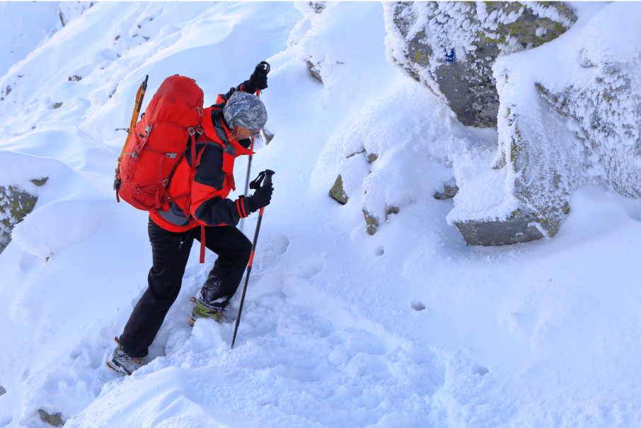
Right Out of the Blue - Supporting Photos
Photography Attributes
Photos in this tier may not include a human aspect. They are generally focused on one subject matter and exist to support the other two tiers.
Criteria
The photo must feel authentic to Calgary and the the story it’s supporting.
Supporting Photos Example
What to include
- Where possible show blue sky!
- Scenes and settings that captures an authentic story of Calgary, all taken throughout the four seasons
- Natural lighting that creates a realistic atmosphere - nothing too dark or intimidating
- An obvious focal point
- Vibrancy in the colours with an intentional use of using the brand colours in props or wardrobes (if possible)
- Negative space or breathing room that allows for a headline placement on top
- A range of age, race and gender to represent our multi-cultural city
What to avoid
- Steer clear of grey skies or heavy weather that distracts from the main subject, unless it enhances the image context
- Limit the use of filters, special effects, and lens flares to maintain authenticity
- Avoid anything that appears forced, overly posed, or generic
- Refrain from using AI-generated images that lack a natural feel and do not represent Calgary
Brand In Use
Our brand shows up in ways and places that are unexpected.
We are encouraged to be playful with our execution, and let the message and medium work off each other to reinforce the power behind what it means to be Right Out of the Blue.
General
Business Cards

Powerpoint Template


Bookmarks


Destination Experience
Digital Experience Passes


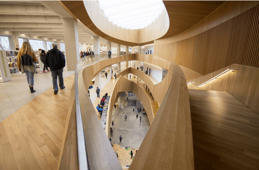
Local Experts Booth - Central Library

2025 Experience Guide


Rotary 2025, Welcome Pageantry


Campaigns
Arts & Culture, Fall 2024


All In, Winter 2025
Dundas Station Takeover, Toronto, Spring 2025 (New)


Local Awareness Campaign, 2024-2025 (New)


B2B
Bid Book


Trade Show Booth

Tradeshow booth, Toronto, Summer 2025

Digital and Social
This week in Calgary


Newsletter templates


White Hat Academy


Informative Materials
Travel Trade Flat Sheet


Travel Trade 24-48 Hours Sheet
Partnerships Branding Projects
YYC Airport, Summer 2025


Blue Sky Arts, partnership with RiseUP and CADA

